Thursday 28 February 2013
28/02/13
In today's lesson we got on with an exam paper as we are still waiting for the new computers to be installed. We have two lessons today so in Mr Phillips lesson we watched the extract for Ashes to Ashes a couple of times and made notes. Then in Miss Thrashers lesson we wrote our notes up in an essay.
Sunday 24 February 2013
Art of the Tiltle
The art of the title is important in a credit sequence as it
signposts the key genre, narrative and theme of the film. It is one of
the first impressions you will make on the audience, so it important to
get it right and make sure it flows smoothly with the film.
 In
Dexter the titles are in a blood red colour. This matches with the
theme of blood in the credits, first with the mosquito and then Dexter
cutting himself shaving. The font used in Dexter is strong and bold,
this matches the character of Dexter as an antihero. However, sometimes
the titles shake or move around, this could suggest Dexter's
unconventionality and also suggest he is not perfect which matches with the fact that he is a serial killer.
In
Dexter the titles are in a blood red colour. This matches with the
theme of blood in the credits, first with the mosquito and then Dexter
cutting himself shaving. The font used in Dexter is strong and bold,
this matches the character of Dexter as an antihero. However, sometimes
the titles shake or move around, this could suggest Dexter's
unconventionality and also suggest he is not perfect which matches with the fact that he is a serial killer.
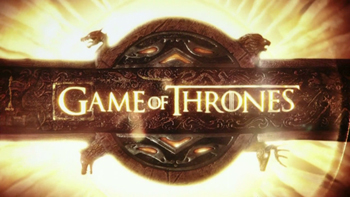 Another example is Game of Thrones. The titles in this are set on a map, this is done to show you that the show is set in another place. The font is really majestic looking and fits in to the medieval theme within the show. The color of the font is gold which again adds to the regal feel and the medieval theme.
In
Dexter the titles are in a blood red colour. This matches with the
theme of blood in the credits, first with the mosquito and then Dexter
cutting himself shaving. The font used in Dexter is strong and bold,
this matches the character of Dexter as an antihero. However, sometimes
the titles shake or move around, this could suggest Dexter's
unconventionality and also suggest he is not perfect which matches with the fact that he is a serial killer. Another example is Game of Thrones. The titles in this are set on a map, this is done to show you that the show is set in another place. The font is really majestic looking and fits in to the medieval theme within the show. The color of the font is gold which again adds to the regal feel and the medieval theme.
Subscribe to:
Posts (Atom)